
Contribution-Value Plots
2021, 11 SepContribution-Value Plots are a visualization technique we built as part of my PhD at the Eindhoven University of Technology in collaboration with Achmea. It aims to help data scientists to analyze and understand predictive models, and can be used as one of the elementary building blocks for interpretability visualization.
Why?
Modern machine learning models are usually applied in a black-box manner: only the input (data) and output (predictions) are considered, the inner workings are considered too complex to understand.
How?
To solve the black-box problem, one key approach is to show the impact of a feature on the model prediction. These techniques are commonly used as elementary building blocks for interpretability visualization.
We experimented with combining feature contribution and sensitivity analysis techniques: our contributions are highighted in blue.
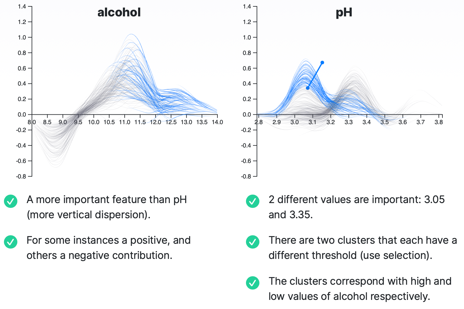
Contribution-Value Plots
A basic example of the Wine Quality data set, and a Random Forest with 100 trees as the complex model we would like to analyze:
For more information about Contribution-Value Plots, you can check out the dedicated website (although the content is fairly similar), and the paper published in the Journal of Visualization 2021 (Springer). An online demo, as well as a link to the source code can be found there.